Showing posts with label Planning (Ancillary Task). Show all posts

Wednesday, 15 February 2017

Look Closer Fact Box

While I was adding more to the text section of my review I noticed that the background just didn't seem right and looked too plain and I started playing around with some different colours but then when I was going through my fonts I thought about maybe having a theme between the background and the fonts which meant a scratchy background so, I went onto Google images to see if there was a scratch PNG file I could easily apply however, there was not so instead I had to use an image with a black background but white and grey scratch already applied onto it. The image itself was only half the size of A4 so I placed it onto my background 4 times and then used the gradient tool to blend them into one another to make it look like one big images but this also allowed me to have some of the plain black background still showing, this allows for the text not the blend with the scratches and help it to still stand out against the black background but also, it doesn't over power the double page spread and gives it the right amount of scratches to plain ratio.


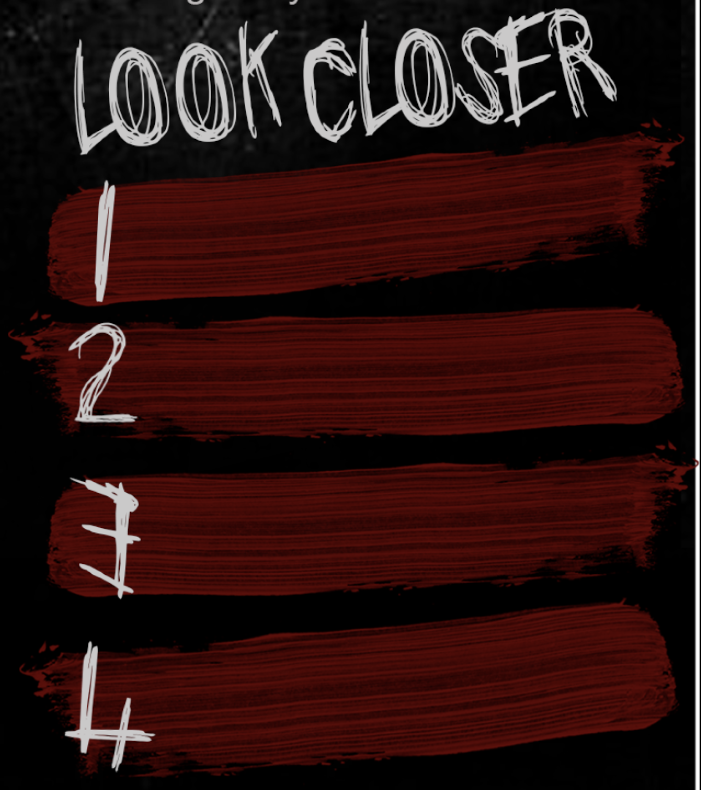
This itself actually helped me with finishing the design for my fact box/look closer section. I had come to a part within the text of the review where I wanted to break it up slightly by using a fact box however, I thought a rectangle box would look out of place amount the scratches and would be the wrong kind of eye-catching I wanted so thinking back to went I google for PNG scratches I remembered that the individual ones could help to match the sort of theme I had going on but then I thought they would be too thin to contain the fact so instead I leaned towards a brush stroke which went in with my storyline as a small part is the character painting out Satantic symbols therefore, this could hint and connote that to the reader. I found a PNG image of a single brush stroke which made it easier to add onto the review page without the struggle of having any white marks around the edges. I created four of the brush strokes to contain the facts and made them the same colour at the title to keep the colour scheme conventional and consistent, the numbers for the fact section are in the same font as the title however, the actual font itself doesn't have numbers built in so I had to create them by using letters and then editing them together which I found actually helps with the loose but at the same time blocky font. Overall, I am really pleased with how it turned out and even though it doesn't look like my initial designs I believe that it helps to keep the flow within the double page spread and helps to make it more interesting and unique, I also decided that seeming as I was using the EMPIRE logo
and that I was mainly using that magazine for inspiration,
that I would keep their conventional 'Look Closer' title for this section.


Monday, 13 February 2017

That Was Close...


I started placing the text part of the review onto the template I had created and altering the lay out to make room for the facts section when something just didn't look right, it looked more like a book then it did a review page, quickly it clicked that I'd forgotten on of the biggest conventions... the column formate/structure the text is usually laid out in. I wasn't actually sure how to create columns in photoshop however, I found out pretty quickly through trail and error and the result looks 10 times better.


I'll probably adjust their font size and positioning as I develop it more but at least step one is complete, so far so good. I have also changed the background to black to go with the conventional horror colour theme but thinking about when I looked through film magazines a majority of the pages would be white with thinks over laying it so a sudden black page should grab the readers attention more.

Friday, 3 February 2017

Film Review - Fact Box Designs

When looking through film magazines such as EMPIRE, I noticed a similar section in most of the reviews which was a small review box which gave the audience some behind the scenes insight and facts about the film. In EMPIRE is was called a 'Look Closer' section with five or 4 bullet points, this is an aspect that I really like as it breaks up the text of the review, it also looks very appealing especially when it matches the colour scheme of the entire review. Another thing their does is allow the a audience better connection with the film and the behind the scenes, so as a result I behind drawing out some designs for a small 'Look Closer/Facts' section of my own but also playing with some colour schemes which I will later one create in photoshop for a digital version. 


The fonts I have used for the designs will not be the fonts I used for the actually final one on my Ancillary product, this is just for the examples and drafts.


For the first design I created (first left), instead of having five bullet points like the majority of the ones I'd seen previous I decided upon having four mainly because it's an even number which is actually known as an audience pleasure as people will usually round things up to them so even though this is an odd reason it could draw the reader into the section. The colour scheme I have chosen is black, red and white which is actually a very conventional colour scheme, especially for the horror genre as it help to connote the genre itself due to the red connoting danger and the black darkness which could actually connote fear as it's known as one of the most common phobias/fears. I made the text for the facts white so that it stands out easily against the black background, making it eye-catching. 

The second design (second from left), where the majority of it is very similar to the first with the exception of the red rectangle going fully across the black background. I did this design to see if it would be better for the entire fact to be separate from the background making it more highlighted and stand out more as it connotes it's importance and that it is indeed the fact, everything else I have kept the same. 

For the third design (third from left), in this one I changed the order of the colour scheme whilst also removing the white. I did this to see if it would change the impact it would could have or it's appearance, personally I prefer the first colour scheme because this one seems as though it is missing something and it all seems to blend in together too much which is something I don't want as I want it to be more appealing and eye-catching. 

For the fourth design (last right), I combined them all together. Having the background red with black rectangles going across it with will contain the fact in a white text to help it stand out more and easy to read but also, I added a small title box saying 'facts' which might later change to something more catchy to draw the readers attention to it like how EMPIRE has 'Look Closer'. I also feel like the use of rectangles and squares give this small fact box some consistency which could be an audience pleasure for the reader as it also gives it a slight aesthetic which is known to be visually pleasing, it also makes it look very professional. 

Doing these I see that I want to take the first design and the fourth forward further when it comes to the final product as the layout and final colour scheme near to the and might effect my decision further so by doing this I will be able to play around with the colour scheme and layout more. 

Friday, 20 January 2017

Film Review Double Page Spread Template #1

I decided to create a quick template for my ancillary task the double page review for my short film, I made in Photoshop CS2 instead of my usual CS6. I decided to make it so that I could have a rough indication of how any images I would like but also text, I personally feel like too much text is off putting whereas, images bring a reader in as they're more interesting and exciting and for that reason I added room for 5 images, 2 small images on the first page within the text to make it more visually pleasing and exciting and a large image with 2 small images on the second page as make that page more image based rather then text. I used my knowledge of the conventions for a review page to create this such as, having the title at the top of the first page as well as the writers names, the use of a facts sections to provide the reader with some insight which is known as an audience pleasure. Also, the section at the end where the film is rated out of five stars, I feel it is important to include these sections to help create a real looking review but also so that the reader can recognise it as a review as first sight. The layout itself is a conventions as the majority of the writing will be placed on the first page with only a small amount on the second as images mostly dominant the second. For now I really like this template/layout and think I'm going to stick with it but most likely make a few adjustments when it comes to putting the final ancillary/review together.

Thursday, 5 January 2017

Logo


The image of the Jester itself could act as a logo alone however, having the words 'MAD Production' there, I found doesn't take away any of the impact or effectiveness of it and therefore I'll keep them however, I could use the jester as something separate when it comes to the opening credit ident for this specific short film. 

Thursday, 29 December 2016

Poster Idea #1


To start showing and creating ideas for my film poster I went onto Google to look for some stock images to help me create some examples/drafts so I can see what worked and what didn't. Above is the first one I have made, in a previous poster I said how I really liked the poster for 'Friday 13th' because of the way it has the antagonist standing in the way of the light as if to connote them standing in the way of their victim's hope of getting away and so when I saw this image I thought it would work well, a difference with this though is that it's not the antagonist standing in front of the image but instead the person who would be the the friend or the victim in my storyline and the light behind them asks as a way how highlighting them but could also connote how they stand in the way of their own escape, linking to the possession aspect I have in my storyline. Also, I wanted to hint that possession even more and placed the a pair of bloody hands clawing towards the person, I put them behind them and slightly angled up as it looks like they are going to grab their head or the person mind connoting how they want to or have a hold/control of the person's mind. The colouring of the hands doesn't work very well as in the original image the hands were very pale and they have a
more airbrushed effect compared to the graining background and person however, if I was to use this structure it would be much easier for me as I will be able to have more control on the outlook of the images and be able to take the pictures in the same environment/setting leading to the same look which would help it flow better.

Trial & Error


As I began to to search for images to make little examples of the main image for my film poster I saw this image of a hand and my initial thoughts were to changed the background to black to go with the conventions of a horror colour scheme but then also to make the hand itself dirty like I did for the examples I did for the antagonist's make-up but as I was doing that I found that the hand itself was positioned in a way that made it look welcoming and gentle which didn't create a creeper or sinister vibe when I tried to add dark and dirty colouring to it so I didn't to scratch that however, when I take some images for my poster I still want to try out the idea to see if it was because it didn't look realistic enough and maybe the dirt and darkness/ make-up needs to be applied before hand fro get the correct effect.


When I tried looking again with I came across the image to the right which shows similar to what I am trying to achieve with this idea as it's comes out of the darkness in a welcoming manner but because of it's colour scheme it's un-nerving which made me come to the conclusion that with this
idea it's the colour scheme and the positioning of the hand that will be the most impactful and effective.

Wednesday, 28 December 2016

Film Review Draft #1


Seeming as I can't add everything yet as I have no finished the main task it's not completely finish yet which is why it's only a draft however, so far I have included facts and some background on the title so that the audience can get a feel for the film and sit's storyline without any indication as to what actually happens but also (like I say in the draft) connotes to the reader to look out for more hidden messages which gives it a sense of mystery and curiosity which always draws people in. Something I know is a good thing to do is to provide both good points and bad points of the film which I found both easy and hard as i didn't want to make my own production sound bad but at the same time I didn't want to be bias so I provided this in a counter argument structure so that the reader got a positive and a negative of the same aspect instead of a whole negative or positive on something.

I still need to add exact figures and involves more credits to the people involved but for now I am happy with that first draft of the text part of the film review, once finished it will hopefully be much longer so that I can create the double page film review however, I don't want to have too much text as I know that, that can actually put people off as it's can look boring so I want to keep it to a good amount so there's a balance of images and text to make it appeal to my target audience.

Wednesday, 21 December 2016

Past Experience With Reviews

The first thing I want to focus on for my double page film review (ancillary task) is the text so that I can then base the images around what is in it to help it all link in and for each aspect to relate to one another. When it comes to the text I do have some past experience as I have written some film reviews on 'Suicide Squad' and 'The Girl On The Train" for the NCS Blog (National Citizens Service.)
Suicide Squad Review - http://www.ncsyes.co.uk/themix/suicide-squad-review
The Girl On The Train Review - http://www.ncsyes.co.uk/themix/girl-train-review-maddy-flaherty-ncs-grad


From both my own knownledge and doing some research I know that the main things I need to include are:
  • A two sided opinion/review because it shows the personality of the writer which could make it more personal for the reader but also it allows for varity and difference from other reviews as it's common for them to be one sided which in effect doesn't give the reader a full picture of the film.
  • Some facts and figures because this gives them some insight to the behind the scenes of the film making them feel more knownledgable which is an audience pleasure but it also gives them an indication of what the expect for example, if the film review said that it had a very large budget then the reader is going to expect a well produced and high quality film with special effects.
  • No spoilers! Telling the reader the storyline would just ruin the film for them so I want to avoid doing anything like that and leave any plot-twists a surprise but rather hint that that are some so that the reader can expect them which just adds to the suspense as they wait for it to happen. Also, if the readers knows that a particular writer gives out spoilers in their reviews they're less likely to read it which would result in less sells for that magazine or page views (depending on platform.)
  • Credit to the actors, companies and individuals involved, this is usually more useful for mainstream films as they will have popular actors in their films which could lead to the reader going to see the film but also, giving credit to any production companies involved, similar to the effects of facts and figures, the reader can take the reputation of the production company and create expectations for the film so, good reputation = good and high expectations.
  • A rating, this conventionally comes after a quick sum up of the whole review at the end and the rating is usually out of five stars, the higher the rating the better the film. Sometimes this can be very eye-catching and gives the reader a first look impression on whether the review is going to be good or bad on the sense of what they think of the film.
I am going to start writing up some drafts of a review for my film to help me with the starting point of the double review page.

Sunday, 18 December 2016

Antagonist Make-Up

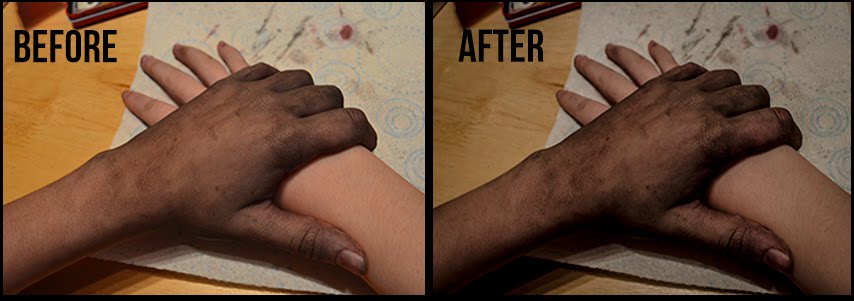
I'm currently thinking of my antagonist's look and how I want to show the use of possession between the female and the antagonist, I've already decided I wanted to have her hands and maybe face look dirty slightly to show the darkness of the antagonist within her. When I was doing some art coursework I saw that the pencil on my fingers gave this sort of effect but when I tried to make it spread it was difficult so instead I used my watercolours to see what effect they gave: (1) Is very little amount (2) I made it darker and added some red to connote blood (3) I made it much darker and spread slightly more up the arm to show the the idea of the evil spreading. After some thinking I decided that it looked better darker as it was more noticable, I thought that maybe I could use the others and gradually build up the darkness whenever is it shown to make it slowly more noticable to the audience which could show the spread from the beginning of the scene to the end.


Seeming as I preferred version three the most, at least for the finishing look of the Antagonist I decided to take some different angled shots of the hand and some side to side shots of what the other characters hand would look like next to the antagonist's so that you can see the difference.

I decided to test out a rough idea of a shot I knew I wanted within my production which was the dark and dirty hand of the antagonist/female to grab another characters to show a clear difference between the two so that anyone in the audience hadn't figured it out now knew, it gives the shot a "gasp" effect which could act as plot-twist. In these picture I used the third version of the make-up and then I used Photoshop CS6 Nikon Editor to change some of settings to see if i could highlight the darkness and evil of the hand while at the same time not changed the clear difference between the two tones. The end result (right) came out to look really good in my opinion, it added a creepiness to the hand while keeping the almost innocent look of the other hand, it also sharpened some of the dark patches on the antagonist hand which actually made it stand out through th whole image but also it looked more natural. To the left you can see the setting's I used, I kept the temperture of the image low becuase the blue didn't show too much in the image but helped with the dark tones within it, also I kept most of the noise reduction settings down as it helped smooth out the image but I also didn't want some of them too low or it looked more cartoony and less realistic which took away the scariness of it and no longer hinted at the horror genre.

I was already going to use Photoshop CS6 when it came to my Ancilary task (Film Poster) but now when it comes to taking the photo's for my poster I will make sure i use a .NEF format so I can also use the PhotoShop CS6 Nikon Editor so I am able to do the same thing with those photos as I have this one.

Tuesday, 13 December 2016

Poster Layout Ideas

I have begun coming up with ideas and making some decisions on what I think would look good on the film poster and also certain ways of positioning things. One poster I particularly like the look of is 'Friday The 13th' because I really like the idea of having the antagonist blocking the light as it could connote them blocking the hope of their victims or maybe even that the antagonist is standing in the way of their escape, hinting slightly at the storyline but also, even though the antagonist is the same darkness as the background the high shinning behind them almost highlights them connoting at their strength and power, this is something conventionally done when their a hero so for it to be used for an Antagonist is very interesting, it also helps the image and that certain aspect be the most eye-catching and dominant part of the poster.

I have decided that I either want the female being posessed as the main and only person on the poster with some signs to connote the antagonist posessing her such as a paint like substance going up her arm or the 2nd character (the friend) looking worried with a long fingers, dirty hand reaching from behind them prehaps with a light shinning behind the hand to connote the same thing as this Friday The 13th Poster. 

Tuesday, 6 December 2016

Production Company Name & Font


From creating some initial Production Name ideas and getting some audience opinions on them I narrowed it down to the following two 'MAD Productions' and 'MAD Entertainment', I then created some examples of the names with three different fonts I really liked the look of and had seen similar ones used in some horror films, my personal favourite one is the middle one as it has some splatters coming from it connoting possibly blood splatters but also the strokes of the font seem sharp and wild linking to the horror genre. I sent these three examples out to my target audience and asked them "Which name do you prefer and which font?" Some I responses I got were:

"I think that Mad Entertainment is definitely the best and well-suited, but the font types depend on the narrative and what kind of horror film you are doing. The last one would work well with a stereotypical gore/spooky/slasher horror, the first one would work well with a psychological horror."

"MAD Productions and I really like the second style :)"


"I think the second style looks the best as it fits in with the horror genre, I think the first font would work well if it was a psychological horror as it's very simples but there's always more then meets the eye just like a any psychology sub-genre. Also, I think MAD Productions is best as it sounds more professional whereas, entertainment sounds less like a horror company but production helps keep the horror vibe going."

"I prefer the production company name of Mad Entertainment and I quite like the 2nd font style for it."

"I like Mad Productions in the middle font or Mad Entertainment in the first font."

"I like the last ones! and i kinda like the sound of entertainment better!"

"I like both names and the two first fonts but I think the middle is the best one."

"I think the 2nd font looks great and the 3rd one too. Ultimately I'd say go with 3rd one which is clear and horror looking"

"The middle font pretty damn sweet!" 

"I'd say 3rd font if you're just only using it for a small horror productions, but if in the long run you're going to create more (non)horror then number 1."

"I think either of these fonts and mad entertainment is better. I think the 3rd font looks more suited to a horror film but I prefer the middle one in general."

"Personally I really like MAD Productions because it sounds professional and can be used for any genre, I also prefer the first font as looks simple but effective and stands out." 

After looking at these responses and opinions and taking in my own preferences I have decided to go with MAD Productions! I came to this decision because like the majority of the responses I got, it sounds more professional but could also but used for more then just horror and possible future projects meaning it's limited to one genre and will work for anything in the same way. For font I have decided that for this particular short film I want it to be the same font so I'm going to test out more fonts on both my Production Company Name and my Short Film Title before I come to a decision however, right now I am leaning towards the 2nd font which is 'Another Danger' because it fits with the horror genre and possibly connoting aspects of the storyline but also, it's the most eye-catching which is just what I want when it comes to the title and production company name in both my main task (short film) and my ancillaries (poster and film review.) 

Monday, 28 November 2016

Branding/Production Company Name

The other day I began thinking about branding and decided I needed to come up with a production company name so to begin with I made a list of quick ideas I had, which were:
  • Mad Films
  • Mad Entertainment
  • MAD
  • Vortex Films
  • M.A.D
  • Mad Productions
  • Supreme Studios
  • Mad Pictures
  • Mad Cinema
After asking some of my peers and through my own decisions I picked my top four and created a 24 hour Twitter Poll to see which one my audience preferred/which they thought sounded better and more professional as a production company name, here are the results:

 In total I got 48 votes from people in the UK, US, France etc. meaning I'm able to apply these results to my audience globally. My top four choices were Mad Films, Mad Entertainment, Mad Pictures and Mad Productions. I chose this people I felt that they're rather simple names but very effective and also easy to pronoun and read meaning it would be easy to recognise also, I used the work 'Mad' for all of them because it started off as a way of incorprating my own name from Maddy to Mad but then it also acts as a slight horror theme as mad can also mean crazy, angry which connotes voilence and weirdness, both things that are conventional in horror films and therefore, I felt it was apprioate for my short horror film. As you can see 'Mad Productions' got 44% of the 48 votes making it the most popular and 'Mad Entertainment' coming second with 31%, I wasn't majorly surprised by the outcome as Mad Productions was also my favourite. One thing someone (Ryan Dawson) did say about the two most popular was:"Definitely Mad Entertainment or Mad Productions becuase it's more Formal and has a business type feel to it."

From these results I think I am going to draft some logo ideas for the two most popular 'Mad Productions' and 'Mad Entertainment' as I like both of these and cannot yet decide so hopefully creating a logo will help me make the decision.