
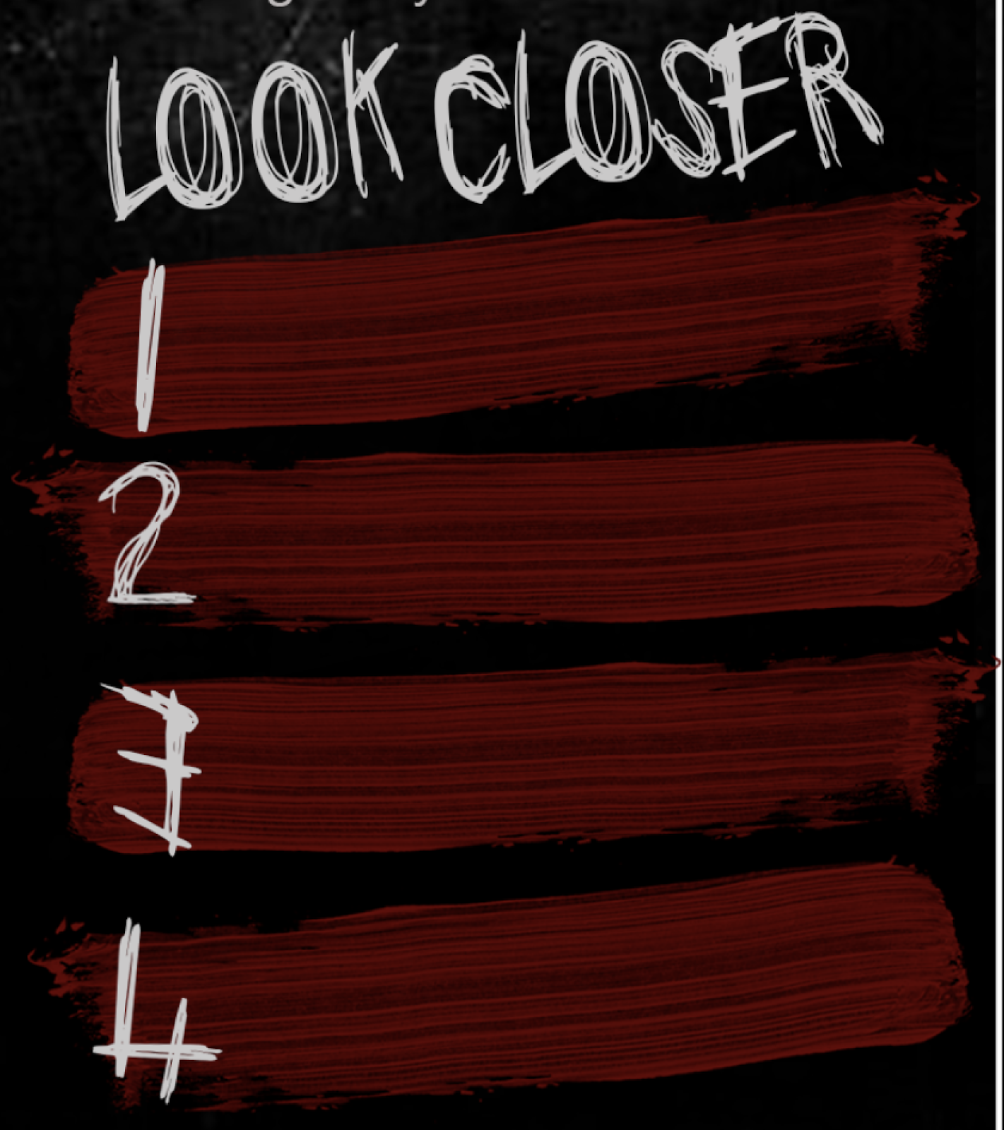
 This itself actually helped me with finishing the design for my fact box/look closer section. I had come to a part within the text of the review where I wanted to break it up slightly by using a fact box however, I thought a rectangle box would look out of place amount the scratches and would be the wrong kind of eye-catching I wanted so thinking back to went I google for PNG scratches I remembered that the individual ones could help to match the sort of theme I had going on but then I thought they would be too thin to contain the fact so instead I leaned towards a brush stroke which went in with my storyline as a small part is the character painting out Satantic symbols therefore, this could hint and connote that to the reader. I found a PNG image of a single brush stroke which made it easier to add onto the review page without the struggle of having any white marks around the edges. I created four of the brush strokes to contain the facts and made them the same colour at the title to keep the colour scheme conventional and consistent, the numbers for the fact section are in the same font as the title however, the actual font itself doesn't have numbers built in so I had to create them by using letters and then editing them together which I found actually helps with the loose but at the same time blocky font. Overall, I am really pleased with how it turned out and even though it doesn't look like my initial designs I believe that it helps to keep the flow within the double page spread and helps to make it more interesting and unique, I also decided that seeming as I was using the EMPIRE logo
and that I was mainly using that magazine for inspiration,
that I would keep their conventional 'Look Closer' title for this section.
No comments:
Post a Comment