I'm currently thinking of my antagonist's look and how I want to show the use of possession between the female and the antagonist, I've already decided I wanted to have her hands and maybe face look dirty slightly to show the darkness of the antagonist within her. When I was doing some art coursework I saw that the pencil on my fingers gave this sort of effect but when I tried to make it spread it was difficult so instead I used my watercolours to see what effect they gave: (1) Is very little amount (2) I made it darker and added some red to connote blood (3) I made it much darker and spread slightly more up the arm to show the the idea of the evil spreading. After some thinking I decided that it looked better darker as it was more noticable, I thought that maybe I could use the others and gradually build up the darkness whenever is it shown to make it slowly more noticable to the audience which could show the spread from the beginning of the scene to the end.
Seeming as I preferred version three the most, at least for the finishing look of the Antagonist I decided to take some different angled shots of the hand and some side to side shots of what the other characters hand would look like next to the antagonist's so that you can see the difference.

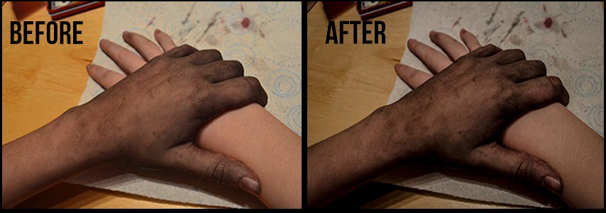
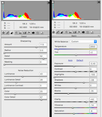
 I decided to test out a rough idea of a shot I knew I wanted within my production which was the dark and dirty hand of the antagonist/female to grab another characters to show a clear difference between the two so that anyone in the audience hadn't figured it out now knew, it gives the shot a "gasp" effect which could act as plot-twist. In these picture I used the third version of the make-up and then I used Photoshop CS6 Nikon Editor to change some of settings to see if i could highlight the darkness and evil of the hand while at the same time not changed the clear difference between the two tones. The end result (right) came out to look really good in my opinion, it added a creepiness to the hand while keeping the almost innocent look of the other hand, it also sharpened some of the dark patches on the antagonist hand which actually made it stand out through th whole image but also it looked more natural. To the left you can see the setting's I used, I kept the temperture of the image low becuase the blue didn't show too much in the image but helped with the dark tones within it, also I kept most of the noise reduction settings down as it helped smooth out the image but I also didn't want some of them too low or it looked more cartoony and less realistic which took away the scariness of it and no longer hinted at the horror genre.
I was already going to use Photoshop CS6 when it came to my Ancilary task (Film Poster) but now when it comes to taking the photo's for my poster I will make sure i use a .NEF format so I can also use the PhotoShop CS6 Nikon Editor so I am able to do the same thing with those photos as I have this one.


No comments:
Post a Comment