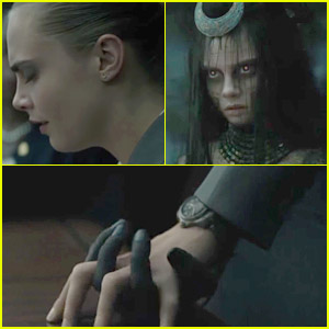
| Candidate Number- 7227 | Main Task - Short Film | Ancillary Task - Film Poster & Film Review |
Thursday, 29 December 2016
Poster Idea #1
To start showing and creating ideas for my film poster I went onto Google to look for some stock images to help me create some examples/drafts so I can see what worked and what didn't. Above is the first one I have made, in a previous poster I said how I really liked the poster for 'Friday 13th' because of the way it has the antagonist standing in the way of the light as if to connote them standing in the way of their victim's hope of getting away and so when I saw this image I thought it would work well, a difference with this though is that it's not the antagonist standing in front of the image but instead the person who would be the the friend or the victim in my storyline and the light behind them asks as a way how highlighting them but could also connote how they stand in the way of their own escape, linking to the possession aspect I have in my storyline. Also, I wanted to hint that possession even more and placed the a pair of bloody hands clawing towards the person, I put them behind them and slightly angled up as it looks like they are going to grab their head or the person mind connoting how they want to or have a hold/control of the person's mind. The colouring of the hands doesn't work very well as in the original image the hands were very pale and they have a
more airbrushed effect compared to the graining background and person however, if I was to use this structure it would be much easier for me as I will be able to have more control on the outlook of the images and be able to take the pictures in the same environment/setting leading to the same look which would help it flow better.
Trial & Error
As I began to to search for images to make little examples of the main image for my film poster I saw this image of a hand and my initial thoughts were to changed the background to black to go with the conventions of a horror colour scheme but then also to make the hand itself dirty like I did for the examples I did for the antagonist's make-up but as I was doing that I found that the hand itself was positioned in a way that made it look welcoming and gentle which didn't create a creeper or sinister vibe when I tried to add dark and dirty colouring to it so I didn't to scratch that however, when I take some images for my poster I still want to try out the idea to see if it was because it didn't look realistic enough and maybe the dirt and darkness/ make-up needs to be applied before hand fro get the correct effect.
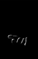
When I tried looking again with I came across the image to the right which shows similar to what I am trying to achieve with this idea as it's comes out of the darkness in a welcoming manner but because of it's colour scheme it's un-nerving which made me come to the conclusion that with this
idea it's the colour scheme and the positioning of the hand that will be the most impactful and effective.
Wednesday, 28 December 2016
Film Review Draft #1
Seeming as I can't add everything yet as I have no finished the main task it's not completely finish yet which is why it's only a draft however, so far I have included facts and some background on the title so that the audience can get a feel for the film and sit's storyline without any indication as to what actually happens but also (like I say in the draft) connotes to the reader to look out for more hidden messages which gives it a sense of mystery and curiosity which always draws people in. Something I know is a good thing to do is to provide both good points and bad points of the film which I found both easy and hard as i didn't want to make my own production sound bad but at the same time I didn't want to be bias so I provided this in a counter argument structure so that the reader got a positive and a negative of the same aspect instead of a whole negative or positive on something.
I still need to add exact figures and involves more credits to the people involved but for now I am happy with that first draft of the text part of the film review, once finished it will hopefully be much longer so that I can create the double page film review however, I don't want to have too much text as I know that, that can actually put people off as it's can look boring so I want to keep it to a good amount so there's a balance of images and text to make it appeal to my target audience.
Wednesday, 21 December 2016
Past Experience With Reviews
The first thing I want to focus on for my double page film review (ancillary task) is the text so that I can then base the images around what is in it to help it all link in and for each aspect to relate to one another. When it comes to the text I do have some past experience as I have written some film reviews on 'Suicide Squad' and 'The Girl On The Train" for the NCS Blog (National Citizens Service.)
Suicide Squad Review - http://www.ncsyes.co.uk/themix/suicide-squad-review
The Girl On The Train Review - http://www.ncsyes.co.uk/themix/girl-train-review-maddy-flaherty-ncs-grad
From both my own knownledge and doing some research I know that the main things I need to include are:
Suicide Squad Review - http://www.ncsyes.co.uk/themix/suicide-squad-review
The Girl On The Train Review - http://www.ncsyes.co.uk/themix/girl-train-review-maddy-flaherty-ncs-grad
From both my own knownledge and doing some research I know that the main things I need to include are:
- A two sided opinion/review because it shows the personality of the writer which could make it more personal for the reader but also it allows for varity and difference from other reviews as it's common for them to be one sided which in effect doesn't give the reader a full picture of the film.
- Some facts and figures because this gives them some insight to the behind the scenes of the film making them feel more knownledgable which is an audience pleasure but it also gives them an indication of what the expect for example, if the film review said that it had a very large budget then the reader is going to expect a well produced and high quality film with special effects.
- No spoilers! Telling the reader the storyline would just ruin the film for them so I want to avoid doing anything like that and leave any plot-twists a surprise but rather hint that that are some so that the reader can expect them which just adds to the suspense as they wait for it to happen. Also, if the readers knows that a particular writer gives out spoilers in their reviews they're less likely to read it which would result in less sells for that magazine or page views (depending on platform.)
- Credit to the actors, companies and individuals involved, this is usually more useful for mainstream films as they will have popular actors in their films which could lead to the reader going to see the film but also, giving credit to any production companies involved, similar to the effects of facts and figures, the reader can take the reputation of the production company and create expectations for the film so, good reputation = good and high expectations.
- A rating, this conventionally comes after a quick sum up of the whole review at the end and the rating is usually out of five stars, the higher the rating the better the film. Sometimes this can be very eye-catching and gives the reader a first look impression on whether the review is going to be good or bad on the sense of what they think of the film.
Sunday, 18 December 2016
Antagonist Make-Up
I'm currently thinking of my antagonist's look and how I want to show the use of possession between the female and the antagonist, I've already decided I wanted to have her hands and maybe face look dirty slightly to show the darkness of the antagonist within her. When I was doing some art coursework I saw that the pencil on my fingers gave this sort of effect but when I tried to make it spread it was difficult so instead I used my watercolours to see what effect they gave: (1) Is very little amount (2) I made it darker and added some red to connote blood (3) I made it much darker and spread slightly more up the arm to show the the idea of the evil spreading. After some thinking I decided that it looked better darker as it was more noticable, I thought that maybe I could use the others and gradually build up the darkness whenever is it shown to make it slowly more noticable to the audience which could show the spread from the beginning of the scene to the end.
Seeming as I preferred version three the most, at least for the finishing look of the Antagonist I decided to take some different angled shots of the hand and some side to side shots of what the other characters hand would look like next to the antagonist's so that you can see the difference.
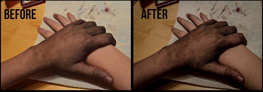
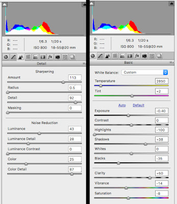 I decided to test out a rough idea of a shot I knew I wanted within my production which was the dark and dirty hand of the antagonist/female to grab another characters to show a clear difference between the two so that anyone in the audience hadn't figured it out now knew, it gives the shot a "gasp" effect which could act as plot-twist. In these picture I used the third version of the make-up and then I used Photoshop CS6 Nikon Editor to change some of settings to see if i could highlight the darkness and evil of the hand while at the same time not changed the clear difference between the two tones. The end result (right) came out to look really good in my opinion, it added a creepiness to the hand while keeping the almost innocent look of the other hand, it also sharpened some of the dark patches on the antagonist hand which actually made it stand out through th whole image but also it looked more natural. To the left you can see the setting's I used, I kept the temperture of the image low becuase the blue didn't show too much in the image but helped with the dark tones within it, also I kept most of the noise reduction settings down as it helped smooth out the image but I also didn't want some of them too low or it looked more cartoony and less realistic which took away the scariness of it and no longer hinted at the horror genre.
I was already going to use Photoshop CS6 when it came to my Ancilary task (Film Poster) but now when it comes to taking the photo's for my poster I will make sure i use a .NEF format so I can also use the PhotoShop CS6 Nikon Editor so I am able to do the same thing with those photos as I have this one.
Thursday, 15 December 2016
Tuesday, 13 December 2016
Poster Layout Ideas
 I have begun coming up with ideas and making some decisions on what I think would look good on the film poster and also certain ways of positioning things. One poster I particularly like the look of is 'Friday The 13th' because I really like the idea of having the antagonist blocking the light as it could connote them blocking the hope of their victims or maybe even that the antagonist is standing in the way of their escape, hinting slightly at the storyline but also, even though the antagonist is the same darkness as the background the high shinning behind them almost highlights them connoting at their strength and power, this is something conventionally done when their a hero so for it to be used for an Antagonist is very interesting, it also helps the image and that certain aspect be the most eye-catching and dominant part of the poster.
I have decided that I either want the female being posessed as the main and only person on the poster with some signs to connote the antagonist posessing her such as a paint like substance going up her arm or the 2nd character (the friend) looking worried with a long fingers, dirty hand reaching from behind them prehaps with a light shinning behind the hand to connote the same thing as this Friday The 13th Poster.
Thursday, 8 December 2016
Short Film Title
Seeming as I have decided on my Production Company Name I thought it was a good time to decide on my Short Film Title because that wall I will be able to chose a well-suited font that I can then possibly use for the production company name font or one that matches to get it a slight theme.
I brainstormed some ideas and then picked my three favourites:
For both 'Don't Be Fooled' and 'Look Closer' I came up with for similar reasons. These titles almost act as a warning that the audience would hopefully go and watch the short film with them in mind and wondering what does this mean and actually end up paying more attention to see the connection between the storyline and the title and another thing is it linking to the storyline as neither the audience or the character actually know that the antagonist is the female until the end so it connotes to the audience to watch out for something without giving anything away and almost a "everything is not as it seems" sort of thing.
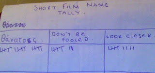 I conducted a small amount of audience research where I asked 30 people in my target audience which Title they preferred and I collected this in a tally chart.
After explaining a brief of my storyline to them without giving too much away but enough detail I found that Θάνατος was the most popular. Some people said that it was interesting and cool, the link between that word and the storyline with the whole greek myth links is also really clever to involve.
I think my next step it to take the title Θάνατος and try out some different fonts with it to see which one suits it the best and which don't, to then hopefully come to a final decision.
I brainstormed some ideas and then picked my three favourites:
- Θάνατος
- Don't Be Fooled
- Look Closer
For both 'Don't Be Fooled' and 'Look Closer' I came up with for similar reasons. These titles almost act as a warning that the audience would hopefully go and watch the short film with them in mind and wondering what does this mean and actually end up paying more attention to see the connection between the storyline and the title and another thing is it linking to the storyline as neither the audience or the character actually know that the antagonist is the female until the end so it connotes to the audience to watch out for something without giving anything away and almost a "everything is not as it seems" sort of thing.
 I conducted a small amount of audience research where I asked 30 people in my target audience which Title they preferred and I collected this in a tally chart.
After explaining a brief of my storyline to them without giving too much away but enough detail I found that Θάνατος was the most popular. Some people said that it was interesting and cool, the link between that word and the storyline with the whole greek myth links is also really clever to involve.
I think my next step it to take the title Θάνατος and try out some different fonts with it to see which one suits it the best and which don't, to then hopefully come to a final decision.
Tuesday, 6 December 2016
Production Company Name & Font
From creating some initial Production Name ideas and getting some audience opinions on them I narrowed it down to the following two 'MAD Productions' and 'MAD Entertainment', I then created some examples of the names with three different fonts I really liked the look of and had seen similar ones used in some horror films, my personal favourite one is the middle one as it has some splatters coming from it connoting possibly blood splatters but also the strokes of the font seem sharp and wild linking to the horror genre. I sent these three examples out to my target audience and asked them "Which name do you prefer and which font?" Some I responses I got were:
"I think that Mad Entertainment is definitely the best and well-suited, but the font types depend on the narrative and what kind of horror film you are doing. The last one would work well with a stereotypical gore/spooky/slasher horror, the first one would work well with a psychological horror."
"MAD Productions and I really like the second style :)"
"I think the second style looks the best as it fits in with the horror genre, I think the first font would work well if it was a psychological horror as it's very simples but there's always more then meets the eye just like a any psychology sub-genre. Also, I think MAD Productions is best as it sounds more professional whereas, entertainment sounds less like a horror company but production helps keep the horror vibe going."
"I prefer the production company name of Mad Entertainment and I quite like the 2nd font style for it."
"I like Mad Productions in the middle font or Mad Entertainment in the first font."
"I like the last ones! and i kinda like the sound of entertainment better!"
"I like both names and the two first fonts but I think the middle is the best one."
"I'd say 3rd font if you're just only using it for a small horror productions, but if in the long run you're going to create more (non)horror then number 1."
"I think the 2nd font looks great and the 3rd one too. Ultimately I'd say go with 3rd one which is clear and horror looking"
"The middle font pretty damn sweet!"
"I'd say 3rd font if you're just only using it for a small horror productions, but if in the long run you're going to create more (non)horror then number 1."
"I think either of these fonts and mad entertainment is better. I think the 3rd font looks more suited to a horror film but I prefer the middle one in general."
"Personally I really like MAD Productions because it sounds professional and can be used for any genre, I also prefer the first font as looks simple but effective and stands out."
After looking at these responses and opinions and taking in my own preferences I have decided to go with MAD Productions! I came to this decision because like the majority of the responses I got, it sounds more professional but could also but used for more then just horror and possible future projects meaning it's limited to one genre and will work for anything in the same way. For font I have decided that for this particular short film I want it to be the same font so I'm going to test out more fonts on both my Production Company Name and my Short Film Title before I come to a decision however, right now I am leaning towards the 2nd font which is 'Another Danger' because it fits with the horror genre and possibly connoting aspects of the storyline but also, it's the most eye-catching which is just what I want when it comes to the title and production company name in both my main task (short film) and my ancillaries (poster and film review.)
Monday, 28 November 2016
Branding/Production Company Name
The other day I began thinking about branding and decided I needed to come up with a production company name so to begin with I made a list of quick ideas I had, which were:
 In total I got 48 votes from people in the UK, US, France etc. meaning I'm able to apply these results to my audience globally. My top four choices were Mad Films, Mad Entertainment, Mad Pictures and Mad Productions. I chose this people I felt that they're rather simple names but very effective and also easy to pronoun and read meaning it would be easy to recognise also, I used the work 'Mad' for all of them because it started off as a way of incorprating my own name from Maddy to Mad but then it also acts as a slight horror theme as mad can also mean crazy, angry which connotes voilence and weirdness, both things that are conventional in horror films and therefore, I felt it was apprioate for my short horror film. As you can see 'Mad Productions' got 44% of the 48 votes making it the most popular and 'Mad Entertainment' coming second with 31%, I wasn't majorly surprised by the outcome as Mad Productions was also my favourite. One thing someone (Ryan Dawson) did say about the two most popular was:"Definitely Mad Entertainment or Mad Productions becuase it's more Formal and has a business type feel to it."
From these results I think I am going to draft some logo ideas for the two most popular 'Mad Productions' and 'Mad Entertainment' as I like both of these and cannot yet decide so hopefully creating a logo will help me make the decision.
- Mad Films
- Mad Entertainment
- MAD
- Vortex Films
- M.A.D
- Mad Productions
- Supreme Studios
- Mad Pictures
- Mad Cinema
 In total I got 48 votes from people in the UK, US, France etc. meaning I'm able to apply these results to my audience globally. My top four choices were Mad Films, Mad Entertainment, Mad Pictures and Mad Productions. I chose this people I felt that they're rather simple names but very effective and also easy to pronoun and read meaning it would be easy to recognise also, I used the work 'Mad' for all of them because it started off as a way of incorprating my own name from Maddy to Mad but then it also acts as a slight horror theme as mad can also mean crazy, angry which connotes voilence and weirdness, both things that are conventional in horror films and therefore, I felt it was apprioate for my short horror film. As you can see 'Mad Productions' got 44% of the 48 votes making it the most popular and 'Mad Entertainment' coming second with 31%, I wasn't majorly surprised by the outcome as Mad Productions was also my favourite. One thing someone (Ryan Dawson) did say about the two most popular was:"Definitely Mad Entertainment or Mad Productions becuase it's more Formal and has a business type feel to it."
From these results I think I am going to draft some logo ideas for the two most popular 'Mad Productions' and 'Mad Entertainment' as I like both of these and cannot yet decide so hopefully creating a logo will help me make the decision.
Tuesday, 15 November 2016
Tutorials on how to reduce noise/grain
Something I know I personally struggle with when it comes to filming is the noise/grain that can appear on the clips, I have mentioned this in an eariler post and looking around youtube I have found some more tutorials on how to reduce the amount of grain/noise while filming but also in post-production which could come in useful if I do have any clips that i find have a lot of grain/noise when I come to editing.
I shall continously be on the look out for any more tutorials or advice I can get to overcome the issue of noise/grain as reducing it can really help my production have that professional look, I did try out some tips that were suggesting in the first video where they addressed the iOS setting and I found that it made some difference and I actually managed to make it more graining/noisey so now I need to figure out how to go in the opposite direction.
Monday, 14 November 2016
Getting Advice
As I have said before, our production will definitely have some low lighting in it which isn't one of my strengths, so I've been looking at tutorials and seeking advice from people I know work well and can overcome low lighting, one person I asked for advice from was my friend Leo who makes videos/short films (through self teachings) such as, are you asleep? & Parallel, both of this short films are short in close to pitch black.
I messaged Leo and asked him how he achieved the professional look it had with low lighting and if there was any advice he could give me so I can also achieve it.
Leo replied with " it looks like low lighting, but I actually had pretty bright coloured lights. Although there are ways to shoot in low lighting. You can get a lens with a high aperture or have a subtle lighting in your videos."
In response to Leo's response I played around with my camera to discover that when the camera I will be using (Nikon D5100) is in Mode A (Aperture) I can turn a dial to adjust the brightness the shot will actually turn out in the final production meaning I can use my softbox lighting to prevent noise but then use Mode A to lower the amount of light on the final shot without adding any noise to the shot. I haven't fully perfected this yet however, I believe that this is progress and with some practice and I can achieve a very professional low lighting film look.
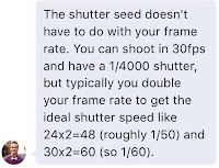
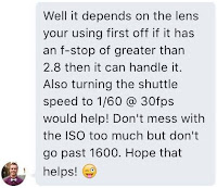 I also messaged another one of my friends Matt Brosey who is currently studying film in the US and has also won awards for his short film. I asked him if he had any advice/facts/tips when it came to grain/noise on footage and the screenshots to the left are his responses. He replied with similar advice I had found in the youtube tutorials I've found previously. This has also shown me that I can look into more aspects to help me get the perfect and professional look rather then just searching 'reducing noise.'
I messaged Leo and asked him how he achieved the professional look it had with low lighting and if there was any advice he could give me so I can also achieve it.
Leo replied with " it looks like low lighting, but I actually had pretty bright coloured lights. Although there are ways to shoot in low lighting. You can get a lens with a high aperture or have a subtle lighting in your videos."
In response to Leo's response I played around with my camera to discover that when the camera I will be using (Nikon D5100) is in Mode A (Aperture) I can turn a dial to adjust the brightness the shot will actually turn out in the final production meaning I can use my softbox lighting to prevent noise but then use Mode A to lower the amount of light on the final shot without adding any noise to the shot. I haven't fully perfected this yet however, I believe that this is progress and with some practice and I can achieve a very professional low lighting film look.

 I also messaged another one of my friends Matt Brosey who is currently studying film in the US and has also won awards for his short film. I asked him if he had any advice/facts/tips when it came to grain/noise on footage and the screenshots to the left are his responses. He replied with similar advice I had found in the youtube tutorials I've found previously. This has also shown me that I can look into more aspects to help me get the perfect and professional look rather then just searching 'reducing noise.'
I also commented on my another short film created with a Nion D5100 (the camera I shall be using) and here is the response i got:
Film Poster MoodBoard/ Additional Research
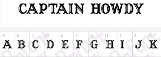 I wanted to narrow down the type of film posters I was looking at from Horror film posters to more supernatural horror but also specifically Ouija film posters and I found that for Ouija film poster they always used the same or near to the same font called "Howdy Captain" therefore making it a conventional font, this is also the font actually on a Ouija Board giving the poster a small theme and consistency.
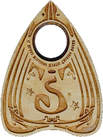
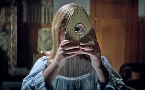
 Just like I found in my Ancillary research these posters follow the conventional colour schemes of black, white, red, dark colours and also a small sepia colour scheme. Something else conventional, specifically in Ouija films is to have a planchette as part of the image. A planchette is the triangle like piece of wood that the players place their hands onto and is then used as a way of communication as it moves, it typically has a small circle cut out with some glasses in it and this represents that on the other side of that glass is the 'spirit world' they're communicating to and during a modern set Ouija film one of the characters actually looks through it and is able to see the spirits around them.
Look at supernatural horror posters as a whole the posters almost always includes the person or the object being posessed/haunted/haunting etc. I believe this is becuase it shows the audiences the sub-genre but also the themes within the film. Taking all of these things into account I have decided that within my poster I want to include just one character and then hints of the Antagonist/spirit but just like the Ouija film posters conventional did, I want to have the ouija board on there whether thats it can the background or infront of the characters I am unsure yet and to help me come to a decision I'll have to do some drafts and see which is best. I also, want to use the Captain Howdy font as it fits in with the storyline of the short film creating consistacny and the audeince will be able to easily understand what it is about.
Saturday, 12 November 2016
Topic Research - Greek Mythology
While doing some idea developments I can looking for words relating/meaning death and came across Thanatos so I have been looking into greek mythology to see if I could in anyway represent him within my storyline. While searching I found two websites who give a clear indication of Thanatis's story and what he represents.
Website #1- Quote :
Thanatos is the daemonic representation of death in Ancient Greek mythology (daemonic here is used with its classical meaning, which refers to benevolent or benign nature spirits). He did not play a major part in Greek mythology and rarely appeared in any stories, as he was mostly displaced by Hades, the god of the Underworld.
He's the son of Nyx (the Night) and Erebos (the Darkness), while his twin brother, Hypnos (the Sleep). Other siblings of Thanatos and Hypnos included Geras (old age), Eris (strife), Nemesis (retribution), Apate (deception) and Charon (the boatman that led the souls to the Underworld).
Thanatos was believed to be merciless and indiscriminate, and both mortals and gods hated him. However, he could sometimes be outsmarted. In a myth, Thanatos was told by Zeus to chain King Sisyphus in the Underworld, as it was time for him to die. Sisyphus managed to chain Thanatos in his own fetters, thus protecting all mortals from dying while the god was chained. In the end, god Ares, angry that at the wars he waged noone died, freed Thanatos and gave Sisyphus to him.
Thanatos Is also called Thanatus, Mors, Letus, Letum.
Webstie link - http://www.greekmythology.com/Other_Gods/Thanatos/thanatos.html
Website #2- Quote :
In ancient Greek religion and mythology, the personification of death. Thanatos was the son of Nyx, the goddess of night, and the brother of Hypnos, the god of sleep. He appeared to humans to carry them off to the underworld when the time allotted to them by the Fates had expired. Thanatos was once defeated by the warrior Heracles, who wrestled him to save the life of Alcestis, the wife of Admetus, and he was tricked by Sisyphus, the king of Corinth, who wanted a second chance at life.
Website Link - https://www.britannica.com/topic/Thanatos-Greek-mythology
Quick Survey Observation
While I was getting responses for the three surveys I made, I found that my main task one (Short Film) was very quick in getting them and so was the poster survey however, it took awhile to get responses for the film review survey and I believe that this is because people aren't as interested in film reviews as whole which in itself acts as some audience research because even though I shared all the surveys the same way and through the same platforms, it took longer for some. Indicating that when it comes to deciding on whether to go see a film or not people are more interested in the film poster then they are the review however, we didn't eventually get all of the responses for the film review showing it still plays an important role.
Friday, 11 November 2016
Inspirations I Found During Plot Blocking

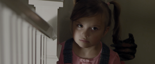 From analysing the Smiling Man I saw that there were some very small but interesting and impactful things within it such as, the way the long fingered hand of the Smiling Man lightly stroking the little girl's pigtail. I really liked this small movement as I found it added a really creepy and suspenseful atmosphere but also it gave the audience more insight as to what was happening then the actually character did, making them more involved into what was happening. This is something that I really wanted to incorporate into my own Short Film and therefore, added the section where one of the characters have gone to the bathroom to calm down and the camera in placed in front of them so the audience can see behind them as a dirty, paint soaked hand reaches from behind them and entwining their fingers in the character's hair but when they turn there is no one to be seen. I also really liked it because it hints at the antagonist without giving away their true identity giving the audience time to create their own picture of them meaning they want to watch till the end to see if their picture matches or not but also, this leaves them with the mystery that is conventional given when it comes to the antagonist, something that can be seen as an audience pleasure when it comes down to the storyline and the antagonist's reveal. Something else that I really liked was that the antagonist themselves were human which makes it slightly more realistic, even if they did have some strange aspects about them such as the sharpened teeth and murderous ways but still, this is something I had already wanted to involve in my storyline mainly because it was the best choice when it came to a low-budget but also because the audience would be able to put themselves in the antagonist's shoes better as in way they're the same species something that can also act as an audience pleasure but also disturb them slightly adding to the creepy and twisted storyline because it shows that someone just as human as them are capable of this, even if it is possession like in my idea.
 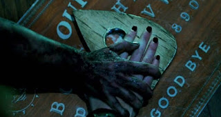 I watched Ouija after I had come up with the initial ideas for my short film to get a better feel for the conventions within the area of Ouija board and the paranormal, one thing I did find was that it both used the idea of Todrov's stereotypical characters types such as the protagonist being strong and brave but it also went again them such as when females are usually portrayed as the damsel in distress in this film they are seem as the more stronger people, I actually found in this film and others like it that it's conventionally the female that is the first to play the Ouija board or puts forward the idea of it this could be interpreted in different ways to the facts that maybe they're brave and don't fear the stories they hear about it, they're really stupid or depending on the storyline could be over emotional to save their friend or find out what happened to them which also links into Todrov's protagonist/hero character types as they're usually seen to have emotion and compassion etc. Due to this I think I unitentially made the main person female because it just seemed like the right fit and then when I watched more of the similar films I was more confident in my choice as it plays into the codes and conventions which can be seen as an audience pleasure. Just like the others I got some Antagonist inspiration from Ouija, similar to Suicide Squad their Antagonist is sort of dirty with a slight mist around them to connote that they're supernatural/paranormal and the colour scheme for them is always dark to connote their evil ways etc. So to see that what I wanted to do was something slightly conventionally done in films similar will help the realism within my own production but also this gives me something to work from when it comes to trying out different looks for the antagonist.
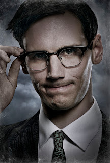 Gotham is a TV show based on the Batman comic series where it focuses on how he became batman and how the antagonist's development into their evil selves, one particular antagonist I'm interested in is Edward Nygma (a.k.a The Riddler.) Before Edward Nygma even became The Riddler he was obsessed with riddles for example, 'What's nowhere but everywhere, except where something is?' The answer is nothing, over time these became more dark, close to dark humour for example, 'A nightmare for some. For others, a saviour I come. My hand's cold and bleak. It's the warm hearts they seek, what am I?' The answer is death. The way that the transition from him being Edward Nygma to him becoming The Riddler is done in the way of him have a split personality almost, he'll be looking in the mirror and suddenly his reflection will be doing different actions to what he is doing which shows the two personalities and sometimes he'll say something, tilt his had and answer himself leading to a conflict betwen his two personalities. I liked the way they did this because it showed the two people within him without having to actually show them both which is something I wanted to incorprate into my production and was actually considering having a shot where the two characters are sitting down and the female suddenly jolts and there's a split second where you see some conflict between the female and the antagonist posessing her as they can help to represent and connote what is happening to the audience.
 Thursday, 10 November 2016
Plot Blocking Notes/ Idea Development
As I said in my Final Pitch I was struggling in completely finishing the storyline so I have decided that to try and help me do so I will do a form of plot blocking where I can pin point certain aspects I definitely want in the storyline and then development them further.
1- First shot of female lead with blood all over her face.
2- Transitions with a black screen with un-human noises and whispers followed by the female lead startled and waking up from what can be assumed as a nightmare, Friend brings round Ouija board asking female lead to take care of it while she goes to work and after some hesitation and refusal she caves in, this portrays her as timid and weak.
3- After friend leaves, the female lead goes about her daily tasks. After some time she starts to hear strange noises such as shuffling, thuds, rattling etc. She goes to check/investigate to find the Ouija board had fallen from where she left it, maybe spilled out onto the floor. She begins to collect it back up to put it in the box when the planchette begins to move across the board and spells out a message(maybe in a different language that translates to something like 'death', 'revenge' maybe Greek word for death = Θάνατος etc.) message could first be spelt using English letters, Oavatoc and then when she looks back she can see it has been corrected to Θάνατος .
4- (Later in the same day, evening time) The friend comes back to the female leads house to collect her Ouija board and walks in to find the living room covered in pieces of paper with some satanic and some other dark symbols (inverted torch?) on to them (drawn/painted on in black and red.) The Ouija board is placed in the centre of the living room floor surrounded by all of the symbols, the friend turns to walk out of the living room but it met by the female lead face-to-face who then shouts 'boo' in her face. (perhaps the audience would be able to see her slightly in the shadows before the friend turned to face her.)
5- They talk for a bit and then when the friend goes to ask female lead about the symbols she find that they're gone, the female lead looks confused but then shrugs it off, the same as the friend. They go to the kitchen to have some drink and when the friend goes to drink it she is met with a horrible copper taste and when she looks she sees it is blood, she spits it out only to find that when she looks back at it, it's water. At this point the friend seems nervous and anxious but the female leads seems joyful and calm.
6- The friend goes to the bathroom to splash water on her face and it cuts to a close up on her face fully in the frame and her looking above it and then suddenly a dirty dark hand twists it's fingers into their hair but when the friend turns to see where this motion had come from they find the bathroom empty.
7- The friend asks for her Ouija board so they go into the living room where the friend had left it the first time, as the female lead goes the collect it the lights flicker slightly as she walks past them and when the friends asks about it the female lead replies with "it's just a power surge" she collects it and hands it to the friend and then suddenly the TV turns on making the friend jump. (when the TV turns on it could possibly be a film with some dialogue saying "you're going to die" or "run" etc. foreboding the next event.)
8- The female lead grabs the friends arm and asks if she's ok and the friend begins to reply with yes when she looks at the female leads hand to see that it is soaked in black paint and then when she raises her head she see that the female lead now has large circles under her eyes with black paint also smudge on her face. Then looking at her surroundings she sees that the paper on the floor with symbols have yet again returned.
9- Scared and confused the friend backs away going to leave but as she turns the female is yet again face-to-face with her and she starts to speak but the female lead grabs the friends shoulder and plunges a weapon possibly a knife into the friends stomach stopping them in their tracks. We would see a reaction shot from both characters, the friend in shock and struggling to breath while the female lead seems expressionless. The whole time this is happening the lights could be flickering, TV getting more chaotic.
10- The friend drops to the floor landing on the symbols and the female lead finished her with one last attack, you don't actually see it but you would be able to hear the sound effects and the last breath the friend would draw connoting her death, as the female lead would stand up you'd be able to see part of the lifeless friend.
11- It would end with the same shot it began with, a close up of her bloody face.
Notes:
They could end up back in the living room and the female lead could kill friend and as she does the symbols re-appear and red blood drips onto the white paper of the symbols.
Number 6 slightly inspired by the Smiling Man/ Ouija
As you can see my idea worked and I have managed to complete my storyline and my next step will be to do another more detailed plot blocking where I can also narrow down the most important sections.
Sunday, 6 November 2016
Final Pitch
Main Task:
A quick summary of my storyline so far is that the female lead's friend will come into her house and ask her if they can leave their Ouija board here while they go work and they'll collect it later as they have party and need to take it and after some hesitation she caves in and says yet. After some time the female lead hears some shuffling and rattling which is followed by a thud only to find the Ouija board is now on the floor. It begins to spell out a word which slightly frightens the female leads and after a reaction shot the screen will cut to black.
An indication of time passing will occur and then the friend will walk into the house to find the living room covered in symbols with the Ouija board placed in the middle of Chaos. She is then met face-to-face with the female lead as she turns out.
For the storyline this is what I have so far as I know I want it to end with the female lead becoming the Antagonist and either end up killing a group of people or just that one individual friend however, I need to fill in the gap between the middle and end which is what I'm currently working on.
To edit my main task I will be using Final Cut Pro X and for music and sound effects I will be using AudioMicro/Youtube Library.
Ancillary Task:
For my ancillary tasks (Film poster and film review) I will be using Adobe Photoshop CS6 to help me create both.
To take the photographs for both I will be using a Nikon D5100 which is the same camera I shall be using to film with.
Saturday, 5 November 2016
Survey Summary
In total I created four surveys using SurveyMonkey, I created two for my main task (short film) and one for each ancillary task (film poster and film review.) I wasn't surprised by the majority of the responses as I had predicted most of them from my own knowledge and personal opinion.
Something I found in all of my surveys was the majority of the responses came from 15 to 20 years old which is very beneficial as that is my target audience and I also believe this is because of the way I distributed the surveys out through social media platforms such as Twitter, Facebook and Instagram as the main demographic for them are similar if not a slightly larger age range.
Looking at my main task surveys I found that the horror genre isn't the most popular possibly due to it's scary and creepy conventions however, I found that even though some people responded saying they don't watch horror films these individuals still answered the other questions showing that even if they don't watch them they still understand the concepts behind the genre and what would be good within it, this is similar for my ancillary tasks with the sense that the responses for my review survey say that not many people read review however, they were able to answer the question to what they think would be good in it etc.
Something I also found relating to all three of my surveys is that my audience like consistency in such as aesthetic, themes (region, revenge), the same structure within a film review (1st person, 3rd person.)
Tuesday, 1 November 2016
Film Review Survey Responses
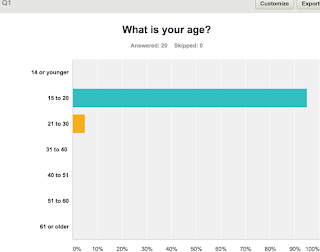 Similar to what I did in my other three surveys, I asked for their ages which then allows me to see what the preferences of each age group are as well being as able to compare between them. Asking this question would also allow me to look directly and individually at my target audiences responses (15 to 20 year olds), I wasn't surprised when I found that the majority of responses I received were from my targeted age group (15-20) as I also found this through my other surveys, I believe this is due to the distribution of it through social media platforms such as Instagram, Twitter and Facebook which is only used by a minority of older people. However, even though this doesn't enable me to compare the results a lot it allows me to really focus on what my target audience want and all the different aspects I could use to include and inspire ideas into my short film.
Question Two "Do you read film reviews often?" is a useful question to ask because it helps me to figure out how familiar both my target audience and people as a whole, with them. Looking at the responses it showed that many people were moderately familiar with film reviews and had read a couple before but also, the option "I read them rarely" was the most popular which I wasn't very surprised about. Things like this suggests that in the age ranges 15 to 20 and 21 to 30, reading film reviews isn’t that common/popular, unless the individual is very interested in it. From looking at the results for this question I know that I will need to make my survey eye-catching to help grab the attention of both my target audience and more because if they aren't searching for it themselves and just pasting over them I would want my review to be there but catch their eye before they pass over it, resulting in them picking it up or clicking on it.
One big convention of a film review is the images however, I wanted to see how many images people preferred so that is why I asked this question. Even though some people responded with 'never' to reading reviews they were still able and still did answer this question as it was more of a personal opinion. From the results of the responses I saw that most people answered with "I prefer only a couple of images" and "Yes, a lot of image" ultimately this question and results will help me when it comes to the layout of the film review because now seeing that my target audience would prefer more images, this also suggests that they find the images more interesting then a lot of text as the images would draw their attention and also help them make a quick impression and decision on whether they want to read the review or not.
Colour schemes is also a key aspect when it comes to a film review page. Question four "Do you think it would be a good idea for the film review to match the colour scheme of the poster?" asks for our audiences opinion and perspective. Unsurprisingly, the results of the responses were found that people thought that having the film poster and review page the same colour schemes is a good idea in one way or another I believe this is the result because something like this can be seen as aesthetically pleasing which is also an audience pleasure, this can also help the audience with recognising and associating both the poster and review with each other and the short film, similar to what brand identity does. I'm happy with these results since I myself would have chosen 'yes' due to the reason of brand identity etc. So when it comes to the drafting of my review this is something I definitely want to incorporate into both my ancillary tasks (poster & film review.)
Saturday, 29 October 2016
Focus Group
Here is mine and Ronan's focus group where we ask them the following questions:
- What do you think would be a better weapon to have in a horror film?
- Do you watch horror films?
- Do you go to the cinema to watch horror films?
- When watching a horror film or any film what age do you prefer the main characters to be?
- What do you think is a good general location for a horror film
- What's your favourite horror film?
- Do you like the idea of the final girl?
- Brief overview of idea, what do you think?
Transcript:
This transcript is provided through Youtube and therefore isn't word for word correct but with some tweaking from me I have tried to get it as close as I can.
0:00
Here I've got Kate and Becca, ok so do you watch
0:05
horror films?
0:06
sometimes, yeah sometimes and what do you
0:10
think would be a better weapon to have
0:12
in a horror film? (Kate) and axe (Becca) a chair. Do you
0:18
go to the cinema to watch horror films? Only
0:21
when forced. If I'm going with people
0:25
yes okay when watching a horror film or
0:29
any film what age do you prefer the main
0:31
characters to be? My age
0:34
yeah roughly my age maybe abit older.
0:36
why? More relatable.
0:39
yeah more relatable ok. what do you
0:43
think is a good general location for
0:45
horror film? with a house forest like
0:50
houses they have any particular haunted
0:52
house or abandon houses? A mansion! A mansion?
0:54
it could be really good in a mansion and
0:58
really creepy, you can have
1:00
different things, so a bit like a woman in
1:03
black... i've never seen it but like a
1:05
scavenger hunt with death then what what
1:08
is your favorite horror film ? the orphan
1:11
orphan and the haunted house. do you
1:15
know the final girl theory? is you know the
1:17
final girl is no it's basically right at the
1:19
end there will be a female protagonist
1:21
which is a hero and she will defeat
1:23
the villain (becca) I'd rather them die.
1:26
no I mean yeah so do you like the idea
1:29
of , to you that they're doing the
1:31
final girl do it (kate) I like the idea of a girl doing it,
1:33
it's always like oh look the boys are the saviors of the
1:35
day it's got girls as the damsels in
1:38
distress not like it you like to have it
1:40
a different powerful women less
1:43
stereotypical actually Baps would really like that.
1:46
I'd rather them die because it's more blood and that and
1:48
it's quite fun. I'm gonna give you a
1:51
brief overview of the idea, we were
1:53
thinking for the introduction and then
1:56
I want to ask but tell me what you think
1:57
so basically it would be a group of children
1:59
going up to a house playing a
2:02
and you're bored and then they'll be
2:04
spared kind of thinking along then it
2:06
turned out the spirits from their past
2:08
and they kind of all took a part in
2:10
killing them about realizing and then
2:13
it's like some bloodshed and regroup and
2:18
bloodshed and stuff like that and then
2:21
we're trying to use symbolism when
2:24
they're not quite sure what yet but we
2:25
won't kind of symbol that means revenge
2:27
symbol that means that and then so it
2:30
means you're doing sinking and then
2:31
right at the end there's one person that
2:32
lives
2:33
the rest I and you see a right there
2:35
reliever people die
2:37
yeah oh so what do you think another
2:41
Ouija board thing why brings me that's
2:45
the age over my head and I think
2:49
actually fly or all of them have been
2:52
surviving no survivors no Kristen cause
2:54
if it kills what they should have got we
2:56
were thinking of in it kind of giving
2:59
green and cream to put brief and quick
3:03
kind of flashbacks to why what they did
3:06
to this person you know and then when I
3:09
yeah I like it just don't make it too
3:11
confusing you doing music types of the
3:14
morning during year to you kind of like
3:16
you know it's like someone hit someone
3:18
and understand you get like a bad
3:19
divider memory
3:20
yeah somebody you'd have to make it
3:22
obvious it is like that yeah but yeah
3:25
do you watch horror films sometimes yes
3:27
sometimes I tend to watch the morning
3:30
with my friend something every day
3:32
another hey what do you think would be a
3:36
better weapon and horror film any weapon
3:40
I think nice usually very conventional
3:44
our film don't think they work really
3:46
well
3:49
machete bit but he's always right back
3:55
to you sometimes get tough shot that way
3:58
of golf actor but not good then we'll
4:01
get more action John me sir
4:05
okay and do you get your sandwich arms
4:08
last time I was with the black can be a
4:12
little bit better for me I think I light
4:18
switch on the light netflix and stuff
4:20
like that yeah but that if the site new
4:22
ones out then i'll probably go to the
4:23
cinema and watch it with some friends
4:24
when watching a horror film or anything
4:26
what HD Batman characters
4:30
oh not not hold the light of twenties if
4:36
it's a little kids like little kids that
4:38
makes it really really creepy
4:40
yeah we're gonna die next older yeah
4:46
like you have young people and as well i
4:48
think i'm doing when you have like
4:49
younger antagonist it's really freaky
4:52
like you see this little girls just like
4:54
staring like this goes the girls and
4:55
freak you out but then I think
4:57
protagonist I like to see like Raj got a
5:00
little bit older I know you can't relate
5:03
to them but there's a sense that you
5:05
like you could be in that position
5:07
yeah do you know what the final girl yes
5:11
final goal now basically
5:15
where you've got kind of got this last
5:19
standing female hero that will kill evil
5:23
dragon she's trying to get the other one
5:25
defeat everyone was die or just ate
5:33
cliché nothing I think it's looking
5:37
more and more cliche and preserve our
5:39
societies like doing like it's just
5:43
forward it like I think it's becoming
5:46
more and more thing but yeah not gonna
5:48
be more of a convention yes I feel my
5:51
just watched don't breathe that had the
5:54
final God theory i think it works really
5:56
well so under man yeah it does what well
5:59
I like it that things are I am going to
6:08
give you a brief overview of what we
6:09
want to do production and like actually
6:12
think so
6:13
reviews that you've got a good kids that
6:15
go to this house and in this house is
6:17
kind of spirit and start playing the wii
6:18
u a Ouija board members the spirit that
6:21
you find out it's connected to them like
6:23
all these people so we helped kill this
6:25
person without maybe realizing and
6:28
they'll have these deaths and i'm going
6:30
to use the final girl very in like this
6:32
one little girl instead of killing
6:34
antagonist was going to escape not going
6:37
to symbolize own kind of thing
6:41
yeah-yeah yeah-yeah-yeah-yeah-yeah just
6:49
end up see yea attempted am ok good
6:56
yeah thank you I'm road and i'm here
6:59
with that I Carter Charlie and yeah i'm
7:04
going to do the focus group
7:06
ok so first question is what do you
7:10
think would be the best weapon type in a
7:11
horror film in your opinion how are we
7:14
good just because it's my sign
7:17
ok baseball bat I think I don't like the
7:21
base about going boys had positive
7:23
because you're my better not
7:25
yeah some kind of blood doesn't look
7:32
very much like really conventional one
7:35
by always good and sheets and one more
7:38
unconventional very suspenseful music
7:40
with a baseball
7:41
I think someone's gonna die I'm going
7:44
it's not out yet
7:46
ok so simple question do you watch our
7:48
phones
7:49
yes my favorite job I love my don't you
7:54
watch our friend was bad like okay okay
7:58
i'll buy you cotton yeah I got a while
8:01
either
8:02
ok do you go to the server to watch
8:04
horror films we actually went crazy on
8:06
the edge like last week slide being
8:09
harmful and the best like I'm not all
8:13
the experiences cabinets and much more
8:15
expensive is dr. yeah moving at light
8:19
sit down it's a bigger screen federal
8:22
Alvarez i think is named don't redirect
8:24
ya shouting more personal statement
8:26
quicker
8:27
ok so we're watching a horror film or
8:30
any other film what age do you prefer
8:32
the main characters to be depending on
8:37
who is this same it's aimed at my age is
8:41
more likely that
8:42
we're going to watch it but if it's like
8:46
an old lady from two doors down and I'm
8:48
not ready to be bothered so it's just
8:50
trying to make it more relatable
8:51
yeah I like if they're middle-aged your
8:53
thirties because they had the chance to
8:55
go live a normal stable life people are
8:57
you haven't yet so that gotten used to
8:59
that for something to call upset and
9:01
experience to be so harsh you know is
9:04
really gonna do something to them
9:06
already knew you perfectly
9:08
yeah you know if it's a and I probably
9:11
say that middle ages
9:13
yeah okay so what do you think is a good
9:18
general location for our film not the
9:21
way
9:22
so what no no ways I just having it
9:29
yeah in a home i think yeah because it
9:32
makes me just any kind of home yeah i'm
9:36
going to be careful boys
9:38
you know it's just a normal how
9:40
everything like modern more convenient
9:42
little bit about the house would be
9:43
really greatly and you go what is your
9:47
favorite horror film that's like a
9:52
horror-comedy yes so it's so hot it's
9:54
going above look good dude there's
10:00
another white yes is a psychological
10:03
harm just ready okay I is either gonna
10:11
be here in or finders keepers
10:14
do you like the idea of the final girl
10:16
and third path because she doesn't do
10:18
media the final girl is basically a
10:21
female country was the last person alive
10:23
in the film
10:24
yes okay yeah and it's not mention
10:31
because you know me and know me know me
10:34
go and I do i get then it's nice
10:38
sometimes to survive
10:39
yeah because we're gonna use be more
10:44
innocent in horror films so you know
10:46
that is usually the woman that survived
10:47
last internet it's what kind of expected
10:50
that because supposed to sorry for which
10:51
is why she got offended by in the evil
10:54
that we watched recently media that has
10:56
a final one
10:57
yeah I think men have been used recently
11:01
and yeah but in females is less
11:05
conventional it just gets a bit
11:09
predictable when you have all that money
11:11
is going to survive
11:12
yeah okay okay so i'm not going to give
11:15
you a brief overview of the idea for our
11:17
film and I'm going to ask you what you
11:19
think at the end of it it's going to be
11:20
a group of teenagers around our age and
11:24
they are going to go to an abandoned
11:27
area that was a place where one of their
11:30
previous friend died when they are there
11:33
they act all stupid like teenagers
11:36
typically do and they end up trying to
11:39
contact the spirit of their dead friend
11:41
and drawing that like throughout the
11:45
film it's going to kind of switch
11:47
between two realities like with a
11:50
reality kind of ghost world where the
11:53
dead ghost friend is and the real world
11:58
and they can like I'm intertwined and do
12:00
things and the main basis that the ghost
12:05
was actually going to slowly get off all
12:07
of the friends
12:08
Wow yes yes until there is one person
12:13
laughter to my just escaped that was a
12:16
really quick brief overview of what the
12:18
film is but what do you think for him
12:21
it might be like a mixture of black 3g
12:24
and strange things
12:26
oh yeah i that much of american horror
12:30
story season once i love the fact that
12:31
you've got a house where there's ghosts
12:34
in especially I never thought I hope
12:36
with the real world and do things and
12:38
they can kill a little guys go to it
12:40
sounds like a typical 1581 the top 10 we
12:45
can come and go by Dan Jojo models or
12:49
hear anything so better to just joins
12:59
the story together
13:00
yeah birds i think it's funny cuz like
13:04
into lon
13:05
ya see the world your ways to save on ya
13:08
I want to try to do something
13:09
interesting that wasn't really don't
13:11
move is good i think it's gonna be a
13:12
little bit difficult people
13:13
we're gonna try because I think we'll
13:15
have to be lily and the focus group is
13:17
over thanks very much for allowing me to
13:20
Arkham goodbye everyone
Subscribe to:
Comments (Atom)


