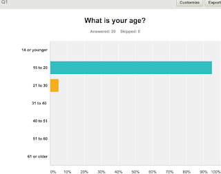
Similar to what I did in my other three surveys, I asked for their ages which then allows me to see what the preferences of each age group are as well being as able to compare between them. Asking this question would also allow me to look directly and individually at my target audiences responses (15 to 20 year olds), I wasn't surprised when I found that the majority of responses I received were from my targeted age group (15-20) as I also found this through my other surveys, I believe this is due to the distribution of it through social media platforms such as Instagram, Twitter and Facebook which is only used by a minority of older people. However, even though this doesn't enable me to compare the results a lot it allows me to really focus on what my target audience want and all the different aspects I could use to include and inspire ideas into my short film.

Question Two "Do you read film reviews often?" is a useful question to ask because it
helps me to figure out how familiar both my target audience and people as a whole,
with them. Looking at the responses it showed that
many people were moderately
familiar with film reviews and had read a couple
before but also, the option "I read them rarely" was the most popular which I wasn't very surprised about. Things like this suggests that in the age ranges 15 to 20 and 21 to 30, reading film reviews isn’t that
common/popular, unless the individual is very interested in it. From looking at the results for this question I know that I will need to make my survey eye-catching to help grab the attention of both my target audience and more because if they aren't searching for it themselves and just pasting over them I would want my review to be there but catch their eye before they pass over it, resulting in them picking it up or clicking on it.

One big convention of a film review is the images however, I wanted to see how many images people preferred so that is why I asked this question. Even though some people responded with 'never' to reading reviews they were still able and still did answer this question as it was more of a personal opinion. From the
results of the responses I saw that most people answered with "I prefer only a couple of images" and "Yes, a lot of image" ultimately this question and results will help me when it comes to the layout of the film review because now seeing that my target audience would prefer more images, this also suggests that they find the images more interesting then a lot of text as the images would draw their attention and also help them make a quick impression and decision on whether they want to read the review or not.

Colour schemes is also a key aspect when it comes to a film
review page. Question four "Do you think it would be a good idea for the film review to match the colour scheme of the poster?" asks for our
audiences opinion and perspective. Unsurprisingly, the results of the responses were found that people thought that
having the film poster and review page the same colour schemes is a
good idea in one way or another I believe this is the result because something like this can be seen as aesthetically pleasing which is also an audience pleasure, this can also help the audience with recognising and associating both the poster and review with each other and the short film, similar to what brand identity does. I'm happy with these results since I myself would have chosen 'yes' due to the reason of brand identity etc. So when it comes to the drafting of my review this is something I definitely want to incorporate into both my ancillary tasks (poster & film review.)

For question five I asked for opinions on various aspects/area of film
reviews I'd decided the best way to design this question was through a rating system, the higher they ranks something the more important they thought it would be. Through
looking at the average ratings of each
category, I found that it's clear that they all have gotten similar responses/ratings and indicating that the majority of people consider all these areas of equally
importantance when it comes to the film review. Therefore, when it comes down to looking at each of these aspects for my own film review I won't put on area before the other because as seen through these results they all have an important role and impact on the context, visual representation, appeal etc. of the review. One area I wasn't at all surprised about was "information about the film" as the main aim for a film review is to present the reader with the information, critism and facts about the film to help them decide on whether to go and watch it or not and also with "the creativity" coming in as second most important doesn't surprise me because as someone who reads and writes film reviews to look at a boring and dull review page can put me off it instantly but also if the context or the written review isn't grabbing and doesn't draw me in then there's just no desire to read it. A film review needs to captivate their reader whether that is through pictures, text, colour scheme etc.
 Similar to what I did in my other three surveys, I asked for their ages which then allows me to see what the preferences of each age group are as well being as able to compare between them. Asking this question would also allow me to look directly and individually at my target audiences responses (15 to 20 year olds), I wasn't surprised when I found that the majority of responses I received were from my targeted age group (15-20) as I also found this through my other surveys, I believe this is due to the distribution of it through social media platforms such as Instagram, Twitter and Facebook which is only used by a minority of older people. However, even though this doesn't enable me to compare the results a lot it allows me to really focus on what my target audience want and all the different aspects I could use to include and inspire ideas into my short film.


No comments:
Post a Comment