Sunday, 29 January 2017

Painting The Symbols

Throughout this entire planning and research stage I have said how I wanted to use symbols to represent the presence of evil, spirits etc but also to have hidden meanings whether the audience know them or not. While actually creating the drawn/painted symbols for my main task (short film) I came across more symbols which worked well. To do the symbols I used ordinary plain paper and used acrylic paint to paint black symbols onto the paper, I used just plain because that's what you'd find in a everyday house and seeming as that's the location it was set it seemed like the logical options. I didn't do the symbols to perfection as they are supposed to be rushed and have an eerie look to them which the un-neatness gives them. 
Examples of some symbols that I added are the ones above.
  • The first one (left) is a square with a cross in it, quite like a checkbox however, this actually means 'help' so I thought this would be good symbols to include as it can represent/connote how the female(victim) was and is asking for help as she tries to escape the possession of the spirit/antagonist yet no one realises, this is something the audience can also relate to as it's unlikely they will know what this symbol means. 
  • The second one (middle) is more obvious then the others. It is a face/skull and the symbols means death. I thought this was a good fix as it links in with the conventions of the hour genre but also it looks very sinister within the other symbol and draws your attention. I also believe that it is rather unsettling which is a good atmosphere to have when it comes to being the suspense 
  • The last one (right) is a spiral, yet again this is one that is likely to be unknown by the audience. It has different meanings in different translate (e.g. revenge, grief etc.) the translation I am using to represent is the idea that something is brewing/coming which in this case is the spirit. Even though this symbol does have many translations they all relate to the horror conventions rather well so even if something in the audience does know a translation it will not change their idea of the suspense or storyline. 
This symbol is known as a 'Satantic pentagram' I have included it because it a symbol known by almost everyone for it's common use in horror films and just the media in general. I want to use it because it connotes to the audience that what is happening (if even they don't know what) is satantic and evil and shows that even if they don't know what the other symbols means they know they would have a similar meaning/translation to the Santanic Pentagram. Therefore, giving the audience some insight without having to actually tell them but by playing to their own knowledge to make it up in they imagination, this way they continue to watch to see if they're correct or even researching after to see if they were correct.

My next step was to see how they looked in the actual location. I scattered them around to give it a chaotic feel to it, I put some on the walls, tables and all over the floor, the symbols could not be missed which is just what I wanted. Also, seeming as the colour of the carpet is a dark orange and beige the white of the paper stuck out even more, as well as the black symbols painting on making them eye-catching. I am happy with how these turned out, I am going to create more to fill in some of the gaps however, not too many as the gaps show that under all of these symbols there is just an ordinary house from the shots they saw before hand, it also shows the audience that the location has not changed however the state of it has making them just as confused as the character which could actually help them to connect with them and be more engrossed into the storyline. 

Friday, 27 January 2017

Credit Research/Decisions


https://www.studiobinder.com/blog/where-credit-is-due-film-credits-order-hierarchy-with-free-film-credits-template/

While doing another project I went onto Google to look up the correct order for the opening and closing credit sequence and came across the website above which gave me a very simple and helpful bullet pointed list of how the order goes but also they gave me examples from other films to show me how they should be laid out and presented. The font for them can depend on the theme of my short film etc. but usually the opening credits will overlay a shot as the scene plays out whereas, ending credits occurring after the film once the conclusion has been drawn or maybe a cliff-hanger, and are conventionally in the middle of the frame as they move in and out of it like a list.
For my beginning credits I was thinking of doing what I did for my ident draft and having the letters move around to form a word, in this case it would be the names of the people within the credits. I want to do this because it would give the beginning some consistency and a slight theme which can help to set the atmosphere and is known as an audience pleasure, I'm not sure whether I want the opening credits to overlay the shots in the beginning or be on the blank ouija board like the ident because I'm not sure how the transition between the move letter would be to the shot however, I feel like the blank ouija board could become very boring and take up a lot of time. I guess this is something I will have to test out and maybe experiment with to see which one works best.

Tuesday, 24 January 2017

Title Font Designing

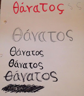
So as you already know I have chosen my Short Film title to be Θάνατος which is the Greek word for death, linking in with my storyline. I have been trying to chose and come up with the font for my title however, have been struggling as only a elect few actually word with the Greek word due to the settings and origin of my computer (UK) as it isn't set in Greek. I attempt to sort this however, it did not solve anything so I decided to try and make my own phone or try to edit an already existing one as I didn't want a standard Microsoft one that would not be effective in setting the atmosphere for both the opening credits and poster.

So to begin with I sketched/wrote out the word Θάνατος to see if there was a way I could draw it out and then trace it digitally through photoshop and as I was doing this I began very neat and straight forward but then started to think about all of the symbols that would be surrounding the Ouija board and thought why not try something in the style of that. slightly more messy which is what ended up being the one at the bottom but then the way that it was messy I felt represented scratches almost which then got me thinking about maybe giving the title the effect as though it has been scratched into the poster or the opening shot which I did try to do at the bottom (in the picture) but it didn't work very well so I switched over to my computer to see what I would do on the internet/photoshop. However, I found that when I tried to write the wrote using the pencil and brush tools it wouldn't have the write effected and honestly looked really bad so I decided that instead of crying to create it from scratch perhaps I could edit a close english lettered version (Oavatoc) into looking like Θάνατος so I then decided to look up fonts with a scratchy look.


I used a website called DaFont to search for the font because I personally feel it is the best website to use as it has a giant variety of different font styles and the download files are 100% trusted and free. The font I ended up finding and using is xxii_scratch, I chose this font because it's very loose and messy which almost connotes at the person who wrote it's rush and careless behaviour as though they don't care how it looked it's just more important that they wrote this particular word. Also, to do this I used Adobe Photoshop CS6 which allows me to work with a transparent background so I will be able to save the text as a .PNG so when I go to place it onto my ancillary tasks I will have no problems with having to fit the background as it can then go onto any or overlay anything as it won't interfere with it.


I used the brush tool to create the first O into the Greek version Θ which was very simple as it was just a line but I had to alter it slightly to make it fit in with the rest of the font's theme. For the T and C it was a case of trail and error as I tried the same method as the O but it didn't seem to fit so instead I used the lasso tool to copy certain parts of other letters to join and add them onto the others to turn the T into τ and the C into ς and I was actually surprised by how well it worked out. The only thing I'm slightly wary of is the A's as the font automatically capitalises the letters with means the I can't make the A's matched the greek like the others or even add the accent onto the first A as it just looks out of place however, I do think that is looks okay without it and could work.


To place it onto my blog I had to change the fonts colour to white which I discovered makes it looks even messier then before for some reason and almost more chaotic which I'm not actually sure if I like or not. However, I think that effect could also be due to the drop shadow I put onto the font to make it stand out slightly on my blogs background which is something I intend not to use on the real thing as that is not something that would actually appear if someone wrote it/scratched it onto something, so I want to keep and add to the realism and the creepiness of the word and font. I really like this style and font but I do feel like I need to make some improvements and adjustments to do, to make it fit with the rest of the fonts I will be using but also if It looks better in black or white or maybe in red as though it was written in blood to give it a sinister and creepy look. Initially I wanted to include a shadow under it spelling out the word death however, I still want to do this but very subtle and in more of reflection, the colour of it depends on the final colour scheme of the poster and title sequence but I believe that a definition is needed for the audience because it adds to the intensity of everything as a whole but also, it could seem very confusing which would draw some people in but also be very off putting for an audience. 


Friday, 20 January 2017

Film Review Double Page Spread Template #1

I decided to create a quick template for my ancillary task the double page review for my short film, I made in Photoshop CS2 instead of my usual CS6. I decided to make it so that I could have a rough indication of how any images I would like but also text, I personally feel like too much text is off putting whereas, images bring a reader in as they're more interesting and exciting and for that reason I added room for 5 images, 2 small images on the first page within the text to make it more visually pleasing and exciting and a large image with 2 small images on the second page as make that page more image based rather then text. I used my knowledge of the conventions for a review page to create this such as, having the title at the top of the first page as well as the writers names, the use of a facts sections to provide the reader with some insight which is known as an audience pleasure. Also, the section at the end where the film is rated out of five stars, I feel it is important to include these sections to help create a real looking review but also so that the reader can recognise it as a review as first sight. The layout itself is a conventions as the majority of the writing will be placed on the first page with only a small amount on the second as images mostly dominant the second. For now I really like this template/layout and think I'm going to stick with it but most likely make a few adjustments when it comes to putting the final ancillary/review together.

Sunday, 15 January 2017

Detailed drawings of my storyboard

For my very first shot and last shot of my storyboard (which are the same), character 1 who is both the antagonist and the victim looks up at the camera and as my storyboard didn't show the expressions of the characters I decided I would do a detailed drawing to help me get inspired for when it come to filming but also to help me with different facial positioning for the shot. While drawing this shot I decided that maybe it would look better if her head was only lowered the slightest big as though she doesn't need to look down anymore, she already knows that the person below her is dead and she has no need to worry. In the official shot she will have blood splatters one her but for this drawing I wanted to focus more on her face positioning rather then the make-up or anything. Something else I liked was having her hair slightly in front of her face as it makes her look like mystery and messy but yet again it shows that she has her head lowered slightly as it hands around her face. However, something I would change is I would have the lighting slightly darker as though there was a torch under her face (like the cliche way of telling ghost stories) but still have some off frame lighting so the shot isn't completely dark and maybe she should have a sinister smile faintly on her face to connote her evil ways to unsettle the audience.

Monday, 9 January 2017

Update

Having previously officially come up with my finished storyline and doing the plot blocking for it I have started the storyboards for it which has both helped me with visualising it and confirming which location I want to use which is actually my own house as I wanted to give it a realistic and mundane feel as if to say you don't have to be in a haunted house for this to happen, it could happen anywhere. I will make a post about my location with some shots etc. With my storyboards I wanted them to be detailed but at the same time I didn't want them to be too time consuming so I went onto Google Images to look up images of storyboards and there were professional ones which looked brilliant but then I came across this one storyboard which drew out the figure of a person but not give them any clothes or facial expressions/hair unless it was required and important to the shot and they would then put numbers of their face so you knew how many there were but also so you knew which character was where and didn't get confused between the two, I really liked this way of doing it as I felt it gave enough detail to understand what was happening and was visually easy to look at rather then having to work out what was what and therefore, I'm using this in my storyboards and finding it very useful and a lot easier to work with then the large amounts of time consuming detail that I have done previously. I am hoping to have them complete very soon.

Thursday, 5 January 2017

Logo


The image of the Jester itself could act as a logo alone however, having the words 'MAD Production' there, I found doesn't take away any of the impact or effectiveness of it and therefore I'll keep them however, I could use the jester as something separate when it comes to the opening credit ident for this specific short film. 

Monday, 2 January 2017

The Making My Of First Ident Draft


To edit my Ident draft I used Final Cut Pro X, this is a sped up video of the process of me creating/editing it all together to get the finishing look (in blog post below.) To achieve how it turned out I used the transform tool within Final Cut Pro and had to individual set the path I want to the letters to travel on so that they formed the word 'MAD Productions.' I did run into some difficult as at one point the letter were too far across and I have to go back and move them around which involved deleting and re-creating the letters transform pathway but I managed to work around it and get it done.

Ident Draft #1


I created this after actually being inspired by the ending credits of one the Harry Potter films where the ink writing moves around and changes into different actors names. Using Adobe Photoshop to cut out the separate letters from the original image I was then able to put them into Final Cut Pro x where I could move them around into the motions in the video. As this is only a first time draft I know there it a lot I can improve on such as, the plain background could be darker or have a pattern but at the same time keeping the ouija board element to make it more professional and interesting, also the letters need to me more finalised when editing them in photoshop as this was done quickly they were slightly chopping which was noticeable when they over-lapped and I think i need to cut some away from the beginning of the ident but add a freeze frame of the finishing words "Mad Production" at the end so the audience can have a moment to take in what it says and then as a whole speed it up slightly but not too much because the slowness gives it an eerie atmosphere which goes well with my storyline.


(Left, Original Image) - (Right, Photoshopped letters)